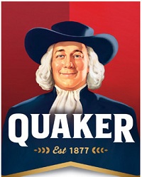
Does Quaker need a new logo?

Is it just me or does Quaker Chemical need to spiff-up that boring-azz logo. The word and font are cool enough, but the "Q" in the circle looks like the international symbol for a uni-sex toilet.
 I'm liking this one a lot better and it's 145 years old. But Larry is taken by a pretty well known food company that's probably looking up our address right now. Is it just company policy these days to be dull? Remember how for decades, IBM required everybody to wear the same suit and have short, greasy hair? It was like "Men in Blue." Finding it difficult to hire good workers in a Google world, IBM is trying to shed that image like dead skin.
 While we're at it, Quaker is big enough to get a Mascot, like those Japanese companies have. I like this guy, but again, he's taken. We could have industry mascot battles at the trade shows. That would be a lot more fun and just as informative as listening to the salesmen.


